Note
Click here to download the full example code
Seasonal Ensemble Model Plots
This example demonstrates the loading of a lagged ensemble dataset from the GloSea4 model, which is then used to produce two types of plot:
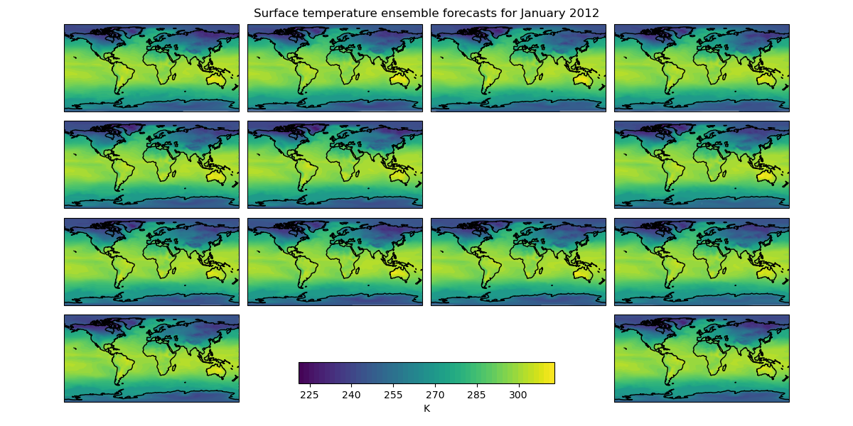
The first shows the “postage stamp” style image with an array of 14 images, one for each ensemble member with a shared colorbar. (The missing image in this example represents ensemble member number 6 which was a failed run)
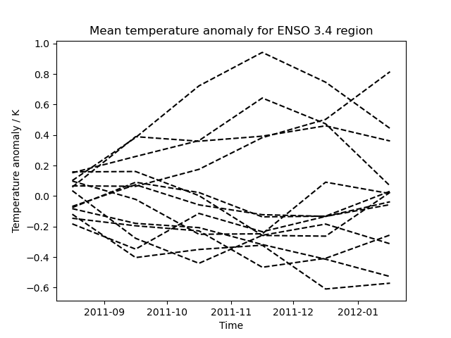
The second plot shows the data limited to a region of interest, in this case a region defined for forecasting ENSO (El Nino-Southern Oscillation), which, for the purposes of this example, has had the ensemble mean subtracted from each ensemble member to give an anomaly surface temperature. In practice a better approach would be to take the climatological mean, calibrated to the model, from each ensemble member.
import matplotlib.pyplot as plt
import numpy as np

import iris
import iris.plot as iplt


def realization_metadata(cube, field, fname):
    """
    A function which modifies the cube's metadata to add a "realization"
    (ensemble member) coordinate from the filename if one doesn't already exist
    in the cube.

    """
    # add an ensemble member coordinate if one doesn't already exist
    if not cube.coords("realization"):
        # the ensemble member is encoded in the filename as *_???.pp where ???
        # is the ensemble member
        realization_number = fname[-6:-3]

        import iris.coords

        realization_coord = iris.coords.AuxCoord(
            np.int32(realization_number), "realization", units="1"
        )
        cube.add_aux_coord(realization_coord)


def main():
    # extract surface temperature cubes which have an ensemble member
    # coordinate, adding appropriate lagged ensemble metadata
    surface_temp = iris.load_cube(
        iris.sample_data_path("GloSea4", "ensemble_???.pp"),
        iris.Constraint("surface_temperature", realization=lambda value: True),
        callback=realization_metadata,
    )

    # -------------------------------------------------------------------------
    # Plot #1: Ensemble postage stamps
    # -------------------------------------------------------------------------

    # for the purposes of this example, take the last time element of the cube
    last_timestep = surface_temp[:, -1, :, :]

    # Make 50 evenly spaced levels which span the dataset
    contour_levels = np.linspace(
        np.min(last_timestep.data), np.max(last_timestep.data), 50
    )

    # Create a wider than normal figure to support our many plots
    plt.figure(figsize=(12, 6), dpi=100)

    # Also manually adjust the spacings which are used when creating subplots
    plt.gcf().subplots_adjust(
        hspace=0.05,
        wspace=0.05,
        top=0.95,
        bottom=0.05,
        left=0.075,
        right=0.925,
    )

    # iterate over all possible latitude longitude slices
    for cube in last_timestep.slices(["latitude", "longitude"]):

        # get the ensemble member number from the ensemble coordinate
        ens_member = cube.coord("realization").points[0]

        # plot the data in a 4x4 grid, with each plot's position in the grid
        # being determined by ensemble member number the special case for the
        # 13th ensemble member is to have the plot at the bottom right
        if ens_member == 13:
            plt.subplot(4, 4, 16)
        else:
            plt.subplot(4, 4, ens_member + 1)

        cf = iplt.contourf(cube, contour_levels)

        # add coastlines
        plt.gca().coastlines()

    # make an axes to put the shared colorbar in
    colorbar_axes = plt.gcf().add_axes([0.35, 0.1, 0.3, 0.05])
    colorbar = plt.colorbar(cf, colorbar_axes, orientation="horizontal")
    colorbar.set_label("%s" % last_timestep.units)

    # limit the colorbar to 8 tick marks
    import matplotlib.ticker

    colorbar.locator = matplotlib.ticker.MaxNLocator(8)
    colorbar.update_ticks()

    # get the time for the entire plot
    time_coord = last_timestep.coord("time")
    time = time_coord.units.num2date(time_coord.bounds[0, 0])

    # set a global title for the postage stamps with the date formated by
    # "monthname year"
    plt.suptitle(
        "Surface temperature ensemble forecasts for %s"
        % (time.strftime("%B %Y"),)
    )

    iplt.show()

    # -------------------------------------------------------------------------
    # Plot #2: ENSO plumes
    # -------------------------------------------------------------------------

    # Nino 3.4 lies between: 170W and 120W, 5N and 5S, so define a constraint
    # which matches this
    nino_3_4_constraint = iris.Constraint(
        longitude=lambda v: -170 + 360 <= v <= -120 + 360,
        latitude=lambda v: -5 <= v <= 5,
    )

    nino_cube = surface_temp.extract(nino_3_4_constraint)

    # Subsetting a circular longitude coordinate always results in a circular
    # coordinate, so set the coordinate to be non-circular
    nino_cube.coord("longitude").circular = False

    # Calculate the horizontal mean for the nino region
    mean = nino_cube.collapsed(["latitude", "longitude"], iris.analysis.MEAN)

    # Calculate the ensemble mean of the horizontal mean. To do this, remove
    # the "forecast_period" and "forecast_reference_time" coordinates which
    # span both "relalization" and "time".
    mean.remove_coord("forecast_reference_time")
    mean.remove_coord("forecast_period")
    ensemble_mean = mean.collapsed("realization", iris.analysis.MEAN)

    # take the ensemble mean from each ensemble member
    mean -= ensemble_mean.data

    plt.figure()

    for ensemble_member in mean.slices(["time"]):
        # draw each ensemble member as a dashed line in black
        iplt.plot(ensemble_member, "--k")

    plt.title("Mean temperature anomaly for ENSO 3.4 region")
    plt.xlabel("Time")
    plt.ylabel("Temperature anomaly / K")

    iplt.show()


if __name__ == "__main__":
    main()
Total running time of the script: ( 0 minutes 17.716 seconds)