Note
Go to the end to download the full example code.
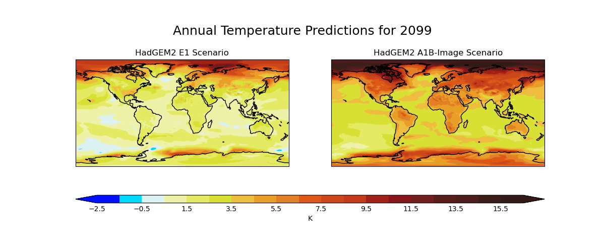
Global Average Annual Temperature Maps#
How to produce comparative maps of two files with a shared colour bar. |
Tags: topic_plotting
Produces maps of global temperature forecasts from the A1B and E1 scenarios.
The data used comes from the HadGEM2-AO model simulations for the A1B and E1 scenarios, both of which were derived using the IMAGE Integrated Assessment Model (Johns et al. 2011; Lowe et al. 2009).
References#
Johns T.C., et al. (2011) Climate change under aggressive mitigation: the ENSEMBLES multi-model experiment. Climate Dynamics, Vol 37, No. 9-10, doi:10.1007/s00382-011-1005-5.
Lowe J.A., C.D. Hewitt, D.P. Van Vuuren, T.C. Johns, E. Stehfest, J-F. Royer, and P. van der Linden, 2009. New Study For Climate Modeling, Analyses, and Scenarios. Eos Trans. AGU, Vol 90, No. 21, doi:10.1029/2009EO210001.
import os.path

import matplotlib.pyplot as plt
import numpy as np

import iris
import iris.coords as coords
import iris.plot as iplt


def cop_metadata_callback(cube, field, filename):
    """Add an "Experiment" coordinate which comes from the filename."""
    # Extract the experiment name (such as A1B or E1) from the filename (in
    # this case it is just the start of the file name, before the first ".").
    fname = os.path.basename(filename)  # filename without path.
    experiment_label = fname.split(".")[0]

    # Create a coordinate with the experiment label in it...
    exp_coord = coords.AuxCoord(
        experiment_label, long_name="Experiment", units="no_unit"
    )

    # ...and add it to the cube.
    cube.add_aux_coord(exp_coord)


def main():
    # Load E1 and A1B scenarios using the callback to update the metadata.
    scenario_files = [
        iris.sample_data_path(fname) for fname in ["E1.2098.pp", "A1B.2098.pp"]
    ]
    scenarios = iris.load(scenario_files, callback=cop_metadata_callback)

    # Load the preindustrial reference data.
    preindustrial = iris.load_cube(iris.sample_data_path("pre-industrial.pp"))

    # Define evenly spaced contour levels: -2.5, -1.5, ... 15.5, 16.5 with the
    # specific colours.
    levels = np.arange(20) - 2.5
    red = (
        np.array(
            [
                0,
                0,
                221,
                239,
                229,
                217,
                239,
                234,
                228,
                222,
                205,
                196,
                161,
                137,
                116,
                89,
                77,
                60,
                51,
            ]
        )
        / 256.0
    )
    green = (
        np.array(
            [
                16,
                217,
                242,
                243,
                235,
                225,
                190,
                160,
                128,
                87,
                72,
                59,
                33,
                21,
                29,
                30,
                30,
                29,
                26,
            ]
        )
        / 256.0
    )
    blue = (
        np.array(
            [
                255,
                255,
                243,
                169,
                99,
                51,
                63,
                37,
                39,
                21,
                27,
                23,
                22,
                26,
                29,
                28,
                27,
                25,
                22,
            ]
        )
        / 256.0
    )

    # Put those colours into an array which can be passed to contourf as the
    # specific colours for each level.
    colors = np.stack([red, green, blue], axis=1)

    # Make a wider than normal figure to house two maps side-by-side.
    fig, ax_array = plt.subplots(1, 2, figsize=(12, 5))

    # Loop over our scenarios to make a plot for each.
    for ax, experiment, label in zip(ax_array, ["E1", "A1B"], ["E1", "A1B-Image"]):
        exp_cube = scenarios.extract_cube(iris.Constraint(Experiment=experiment))
        time_coord = exp_cube.coord("time")

        # Calculate the difference from the preindustial control run.
        exp_anom_cube = exp_cube - preindustrial

        # Plot this anomaly.
        plt.sca(ax)
        ax.set_title(f"HadGEM2 {label} Scenario", fontsize=10)
        contour_result = iplt.contourf(
            exp_anom_cube, levels, colors=colors, extend="both"
        )
        plt.gca().coastlines()

    # Now add a colour bar which spans the two plots.  Here we pass Figure.axes
    # which is a list of all (two) axes currently on the figure.  Note that
    # these are different to the contents of ax_array, because those were
    # standard Matplotlib Axes that Iris automatically replaced with Cartopy
    # GeoAxes.
    cbar = plt.colorbar(
        contour_result, ax=fig.axes, aspect=60, orientation="horizontal"
    )

    # Label the colour bar and add ticks.
    cbar.set_label(preindustrial.units)
    cbar.ax.tick_params(length=0)

    # Get the time datetime from the coordinate.
    time = time_coord.units.num2date(time_coord.points[0])
    # Set a title for the entire figure, using the year from the datetime
    # object. Also, set the y value for the title so that it is not tight to
    # the top of the plot.
    fig.suptitle(
        f"Annual Temperature Predictions for {time.year}",
        y=0.9,
        fontsize=18,
    )

    iplt.show()


if __name__ == "__main__":
    main()
Total running time of the script: (0 minutes 1.423 seconds)