Note
Go to the end to download the full example code.
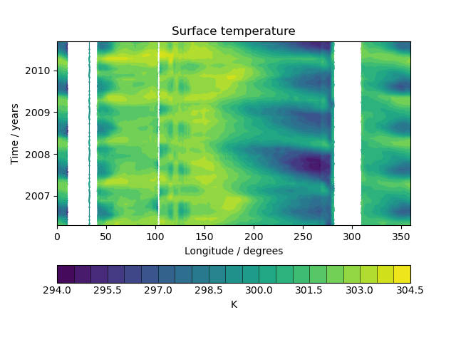
Hovmoller Diagram of Monthly Surface Temperature#
How to collapse and plot Cubes to create a Hovmoller diagram. |
Tags: topic_plotting | topic_maths_stats
This example demonstrates the creation of a Hovmoller diagram with fine control over plot ticks and labels. The data comes from the Met Office OSTIA project and has been pre-processed to calculate the monthly mean sea surface temperature.
import matplotlib.dates as mdates
import matplotlib.pyplot as plt

import iris
import iris.plot as iplt
import iris.quickplot as qplt


def main():
    # load a single cube of surface temperature between +/- 5 latitude
    fname = iris.sample_data_path("ostia_monthly.nc")
    cube = iris.load_cube(
        fname,
        iris.Constraint("surface_temperature", latitude=lambda v: -5 < v < 5),
    )

    # Take the mean over latitude
    cube = cube.collapsed("latitude", iris.analysis.MEAN)

    # Now that we have our data in a nice way, lets create the plot
    # contour with 20 levels
    qplt.contourf(cube, 20)

    # Put a custom label on the y axis
    plt.ylabel("Time / years")

    # Stop matplotlib providing clever axes range padding
    plt.axis("tight")

    # As we are plotting annual variability, put years as the y ticks
    plt.gca().yaxis.set_major_locator(mdates.YearLocator())

    # And format the ticks to just show the year
    plt.gca().yaxis.set_major_formatter(mdates.DateFormatter("%Y"))

    iplt.show()


if __name__ == "__main__":
    main()
Total running time of the script: (0 minutes 0.186 seconds)