Note
Go to the end to download the full example code.
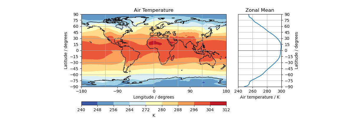
Zonal Mean Diagram of Air Temperature#
How to use aligned plots to visualise collapsed dimensional statistics. |
Tags: topic_plotting | topic_maths_stats
This example demonstrates aligning a linear plot and a cartographic plot using Matplotlib.
import cartopy.crs as ccrs
import matplotlib.pyplot as plt
from mpl_toolkits.axes_grid1 import make_axes_locatable
import numpy as np

import iris
from iris.analysis import MEAN
import iris.plot as iplt
import iris.quickplot as qplt


def main():
    # Loads air_temp.pp and "collapses" longitude into a single, average value.
    fname = iris.sample_data_path("air_temp.pp")
    temperature = iris.load_cube(fname)
    collapsed_temp = temperature.collapsed("longitude", MEAN)

    # Set y-axes with -90 and 90 limits and steps of 15 per tick.
    start, stop, step = -90, 90, 15
    yticks = np.arange(start, stop + step, step)
    ylim = [start, stop]

    # Plot "temperature" on a cartographic plot and set the ticks and titles
    # on the axes.
    fig = plt.figure(figsize=[12, 4])

    ax1 = fig.add_subplot(111, projection=ccrs.PlateCarree())
    im = iplt.contourf(temperature, cmap="RdYlBu_r")
    ax1.coastlines()
    ax1.gridlines()
    ax1.set_xticks([-180, -90, 0, 90, 180])
    ax1.set_yticks(yticks)
    ax1.set_title("Air Temperature")
    ax1.set_ylabel(f"Latitude / {temperature.coord('latitude').units}")
    ax1.set_xlabel(f"Longitude / {temperature.coord('longitude').units}")
    ax1.set_ylim(*ylim)

    # Create a Matplotlib AxesDivider object to allow alignment of other
    # Axes objects.
    divider = make_axes_locatable(ax1)

    # Gives the air temperature bar size, colour and a title.
    ax2 = divider.new_vertical(
        size="5%", pad=0.5, axes_class=plt.Axes, pack_start=True
    )  # creates 2nd axis
    fig.add_axes(ax2)
    cbar = plt.colorbar(
        im, cax=ax2, orientation="horizontal"
    )  # puts colour bar on second axis
    cbar.ax.set_xlabel(f"{temperature.units}")  # labels colour bar

    # Plot "collapsed_temp" on the mean graph and set the ticks and titles
    # on the axes.
    ax3 = divider.new_horizontal(
        size="30%", pad=0.4, axes_class=plt.Axes
    )  # create 3rd axis
    fig.add_axes(ax3)
    qplt.plot(
        collapsed_temp, collapsed_temp.coord("latitude")
    )  # plots temperature collapsed over longitude against latitude
    ax3.axhline(0, color="k", linewidth=0.5)

    # Creates zonal mean details
    ax3.set_title("Zonal Mean")
    ax3.yaxis.set_label_position("right")
    ax3.yaxis.tick_right()
    ax3.set_yticks(yticks)
    ax3.grid()

    # Round each tick for the third ax to the nearest 20 (ready for use).
    data_max = collapsed_temp.data.max()
    x_max = data_max - data_max % -20
    data_min = collapsed_temp.data.min()
    x_min = data_min - data_min % 20
    ax3.set_xlim(x_min, x_max)
    ax3.set_ylim(*ylim)

    plt.show()


if __name__ == "__main__":
    main()
Total running time of the script: (0 minutes 0.295 seconds)