Note
Go to the end to download the full example code
Plotting in Different Projections#
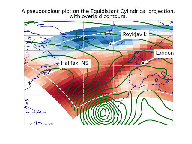
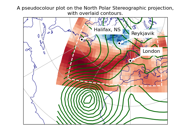
This example shows how to overlay data and graphics in different projections, demonstrating various features of Iris, Cartopy and matplotlib.
We wish to overlay two datasets, defined on different rotated-pole grids. To display both together, we make a pseudocoloured plot of the first, overlaid with contour lines from the second. We also add some lines and text annotations drawn in various projections.
We plot these over a specified region, in two different map projections.
import cartopy.crs as ccrs
import matplotlib.pyplot as plt
import numpy as np

import iris
import iris.plot as iplt

# Define a Cartopy 'ordinary' lat-lon coordinate reference system.
crs_latlon = ccrs.PlateCarree()


def make_plot(projection_name, projection_crs):
    # Create a matplotlib Figure.
    plt.figure()

    # Add a matplotlib Axes, specifying the required display projection.
    # NOTE: specifying 'projection' (a "cartopy.crs.Projection") makes the
    # resulting Axes a "cartopy.mpl.geoaxes.GeoAxes", which supports plotting
    # in different coordinate systems.
    ax = plt.axes(projection=projection_crs)

    # Set display limits to include a set region of latitude * longitude.
    # (Note: Cartopy-specific).
    ax.set_extent((-80.0, 20.0, 10.0, 80.0), crs=crs_latlon)

    # Add coastlines and meridians/parallels (Cartopy-specific).
    ax.coastlines(linewidth=0.75, color="navy")
    ax.gridlines(crs=crs_latlon, linestyle="-")

    # Plot the first dataset as a pseudocolour filled plot.
    maindata_filepath = iris.sample_data_path("rotated_pole.nc")
    main_data = iris.load_cube(maindata_filepath)
    # NOTE: iplt.pcolormesh calls "pyplot.pcolormesh", passing in a coordinate
    # system with the 'transform' keyword:  This enables the Axes (a cartopy
    # GeoAxes) to reproject the plot into the display projection.
    iplt.pcolormesh(main_data, cmap="RdBu_r")

    # Overplot the other dataset (which has a different grid), as contours.
    overlay_filepath = iris.sample_data_path("space_weather.nc")
    overlay_data = iris.load_cube(overlay_filepath, "total electron content")
    # NOTE: as above, "iris.plot.contour" calls "pyplot.contour" with a
    # 'transform' keyword, enabling Cartopy reprojection.
    iplt.contour(overlay_data, 20, linewidths=2.0, colors="darkgreen", linestyles="-")

    # Draw a high resolution margin line, inset from the pcolormesh border.
    # First calculate rectangle corners, 7% in from each corner of the data.
    x_coord, y_coord = main_data.coord(axis="x"), main_data.coord(axis="y")
    x_start, x_end = np.min(x_coord.points), np.max(x_coord.points)
    y_start, y_end = np.min(y_coord.points), np.max(y_coord.points)
    margin = 0.07
    margin_fractions = np.array([margin, 1.0 - margin])
    x_lower, x_upper = x_start + (x_end - x_start) * margin_fractions
    y_lower, y_upper = y_start + (y_end - y_start) * margin_fractions
    steps = np.linspace(0, 1)
    zeros, ones = np.zeros(steps.size), np.ones(steps.size)
    x_delta, y_delta = (x_upper - x_lower), (y_upper - y_lower)
    x_points = x_lower + x_delta * np.concatenate((steps, ones, steps[::-1], zeros))
    y_points = y_lower + y_delta * np.concatenate((zeros, steps, ones, steps[::-1]))
    # Get the Iris coordinate system of the X coordinate (Y should be the same).
    cs_data1 = x_coord.coord_system
    # Construct an equivalent Cartopy coordinate reference system ("crs").
    crs_data1 = cs_data1.as_cartopy_crs()
    # Draw the rectangle in this crs, with matplotlib "pyplot.plot".
    # NOTE: the 'transform' keyword specifies a non-display coordinate system
    # for the plot points (as used by the "iris.plot" functions).
    plt.plot(
        x_points,
        y_points,
        transform=crs_data1,
        linewidth=2.0,
        color="white",
        linestyle="--",
    )

    # Mark some particular places with a small circle and a name label...
    # Define some test points with latitude and longitude coordinates.
    city_data = [
        ("London", 51.5072, 0.1275),
        ("Halifax, NS", 44.67, -63.61),
        ("Reykjavik", 64.1333, -21.9333),
    ]
    # Place a single marker point and a text annotation at each place.
    for name, lat, lon in city_data:
        plt.plot(
            lon,
            lat,
            marker="o",
            markersize=7.0,
            markeredgewidth=2.5,
            markerfacecolor="black",
            markeredgecolor="white",
            transform=crs_latlon,
        )
        # NOTE: the "plt.annotate call" does not have a "transform=" keyword,
        # so for this one we transform the coordinates with a Cartopy call.
        at_x, at_y = ax.projection.transform_point(lon, lat, src_crs=crs_latlon)
        plt.annotate(
            name,
            xy=(at_x, at_y),
            xytext=(30, 20),
            textcoords="offset points",
            color="black",
            backgroundcolor="white",
            size="large",
            arrowprops=dict(arrowstyle="->", color="white", linewidth=2.5),
        )

    # Add a title, and display.
    plt.title(
        "A pseudocolour plot on the {} projection,\nwith overlaid contours.".format(
            projection_name
        )
    )
    iplt.show()


def main():
    # Demonstrate with two different display projections.
    make_plot("Equidistant Cylindrical", ccrs.PlateCarree())
    make_plot("North Polar Stereographic", ccrs.NorthPolarStereo())


if __name__ == "__main__":
    main()
Total running time of the script: (0 minutes 0.675 seconds)
-3.10.0.dev22-gold?style=flat)

